UI vs. UX Design
If you’ve done any kind of research about software design, you’ve probably heard of the terms “UI” and “UX”. But what separates UI from UX?
At their most simple forms, UX design is what makes an interface useful, and UI design is what makes an interface beautiful. For UI, this includes a blend of visual hierarchy and interface elements. To understand what separates a great interface from a good interface, one must understand the UI design is merely just one layer of the entire design process. Perhaps this is why people often confuse UX and UI. In the following few paragraphs, however, I hope to help you as the audience or reader understand where the differences lie in the context of the design process.
According to Garrett in The Elements of the User Experience, UX can be understood in five primary planes.
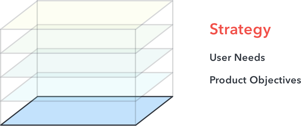
Let’s start with the most abstract plane:
At a high level, the first plane is really the starting block of product design. Here, you’re applying different research methods, including user interviews, competitive analyses, user personas, and other research techniques to understand:
- What is the problem you are trying to solve?
- What are your user needs?
- How does your product fit within a business context (product objectives)?
The second plane:
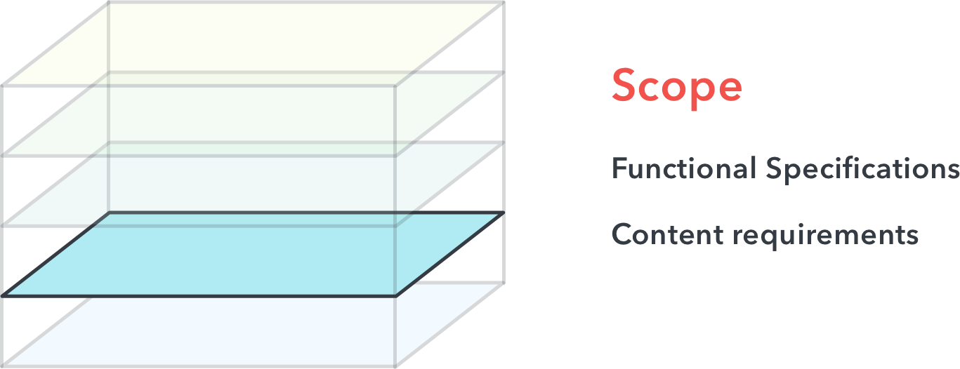
In this stage, you should be defining functional specifications and content requirements of your platform. In other words:
- How might you solve the problems through your platform? What are the features, and how might you prioritize them?
The challenge here for designers is prioritizing features while minimizing tradeoffs. Sure, you might have hundreds of ideas to solve a problem, but you can’t implement all of them.
The third plane:
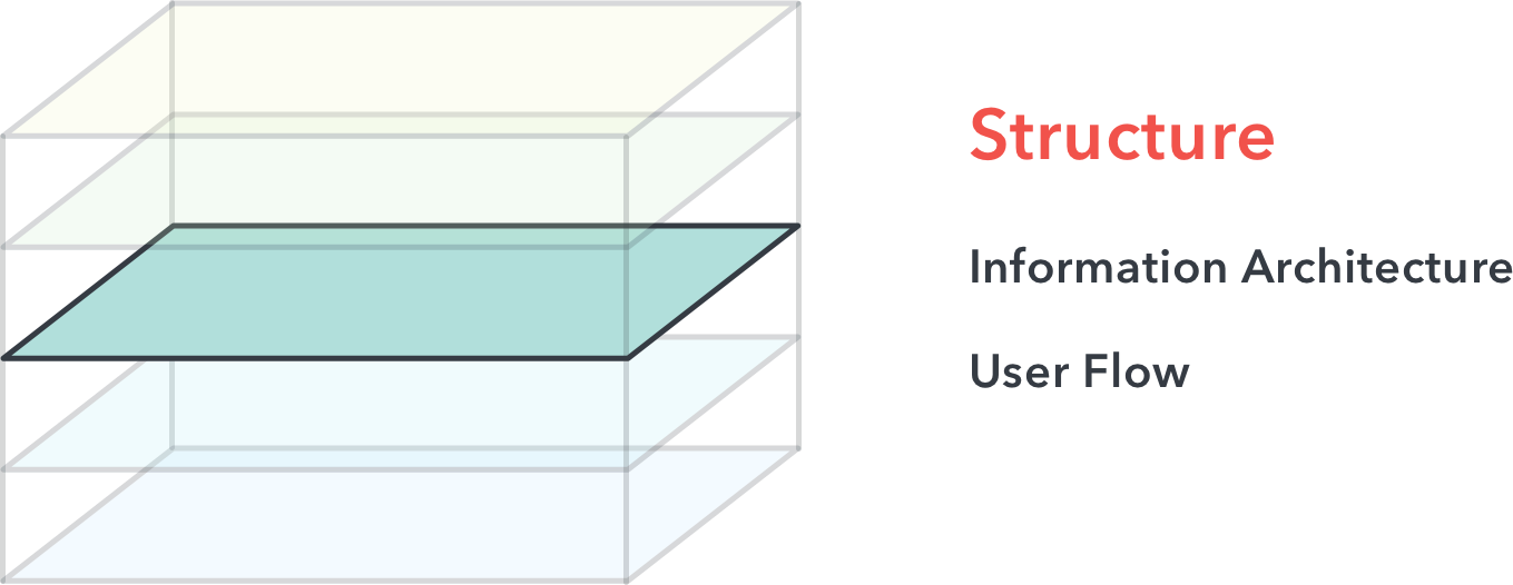
In this stage, your ideas should begin to form a structure. Information architecture is concerned with how the information within an app is organized, and how users cognitively process the information. User flows map out the specific journeys users embark on through the app to help solve their specific need. It’s concerned with the most logical steps for your users to gratify their needs.
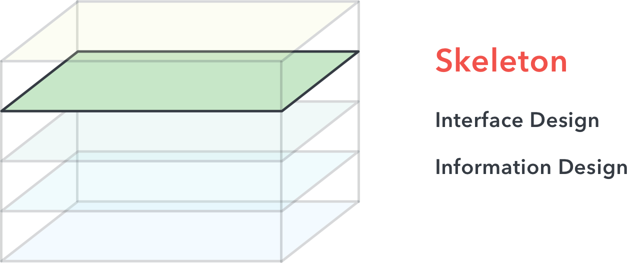
The next plane is where things become less abstract and more concrete:
The skeleton plane seeks to achieve the structure of an interface design and information design. Interface design is concerned with the arrangement of specific interface elements to enable users to interact with the functionality of a system, while information design is concerned with the presentation of information in a way that facilitates understanding.
In this stage, you’ll probably find UX or Product Designers designing, testing, and iterating on wireframes. Wireframes are very low fidelity, often greyscale mockups that demonstrate the intent of each interface element for users.
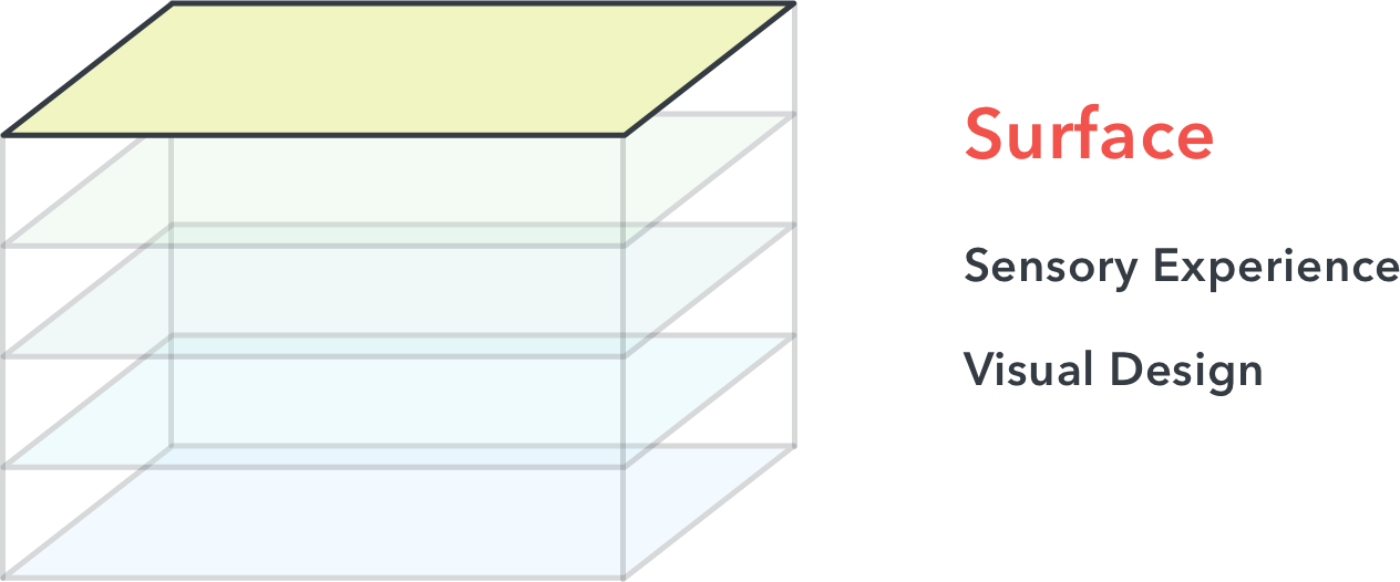
And finally, the most concrete plane:
The surface plane, as the name suggests, strives for great sensory experience and visual design. The goal here for designers is to form a visceral connection with users by successfully communicating the brand, product, value and functionality in one cohesive image.
This is the plane where you’ll find UI Designers and Visual Designers doing the bulk of their work using tools such as Sketch, Photoshop, Adobe Experience Design, Illustrator.
Next, let’s jump into some basic principles of UI Design.
Principle #1: Clarity comes first
There’s nothing worse than ambiguity in an app. What does this button do? How did I get here? How do I go back? In order to avoid this, a designer should always ask themselves:
Why is this here? Does this make sense? What other possibilities can I explore?
Great designers know how to explore the variety of possibilities of an interface layout, the potential tradeoffs of each, and understand which design might help a user best achieve their goals. Clarity in design allows a user to feel confident while navigating through your app.
Principle #2: Provide clear, meaningful feedback
We’ve all used a website or an app where we’ll try to click a button, and we’ll wonder if the system registered the click.
Simply put, every action needs a reaction. If you’re a web developer, for example, changing the :hover state of a button is a common form of feedback to allow your users to understand their hover action.
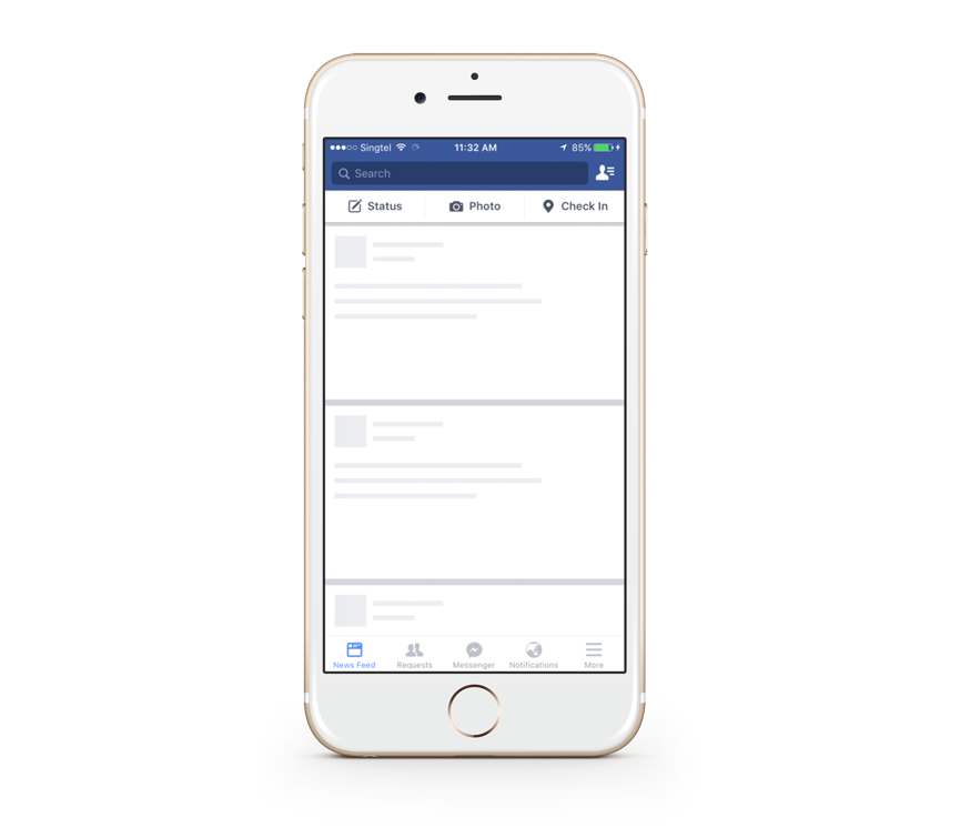
A great example is Facebook’s use of their skeleton loading state. While the user waits for their content to load, a loading state in the shape of the content provides meaningful and relevant feedback for users for them to understand that their content is loading.
Principle #3: Consistency matters
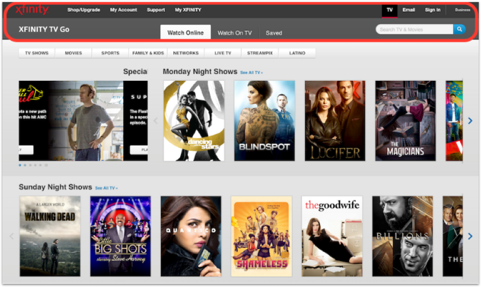
When I refer to consistency, I’m talking about consistency in the placement of interface elements or the language throughout the product. Once your users start learning how to use a product, they shouldn’t have to relearn it. Let’s take a look at an example of bad consistency.
The above example might look like 3 websites from 3 different companies, but it’s actually not. What might make one think that? Well, the navigation bars for each page uses a different set of colors, layout and font styles. As a user, this might be confusing and disorienting, and users might forget that these are all under one single website.
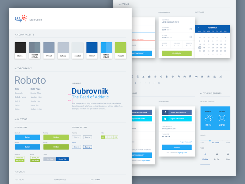
As a designer, how can you maintain consistency throughout your app? You can design your app using a consistent grid system, such as the common 8-point grid system found in mobile apps and icon design. You can also maintain a consistent color scheme and navigational elements across screens. These elements can all be rooted in a style-guide:
The point is: good consistency and structure will make your users feel at home.
Principle #4: When in doubt, use established design patterns
Don’t get me wrong here — innovation is awesome and encouraged, but it shouldn’t have to be at the expense of the user experience. There’s no need to reinvent the wheel if the wheel is doing a great job at doing its job. For example, if you’re ever unsure if an icon accurately or intuitively represents a word, just use the word in its place. Or adhere to common color patterns, such as a shade of red to warn/alert a user, or green to mark something complete.
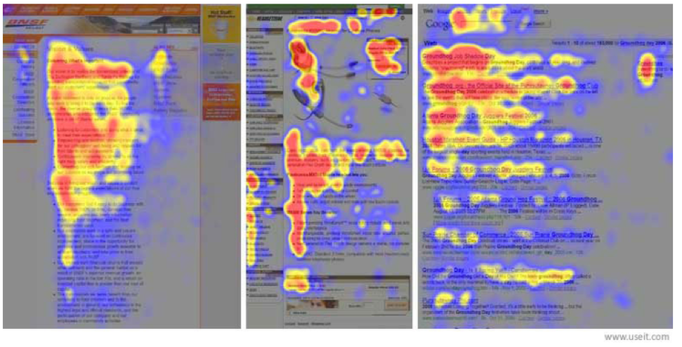
Why use established design patterns? Well, for one, many of these established design principles are grounded in human perception. Let’s take a F-Shaped reading pattern or eye scanning pattern when it comes to reading blocks of content.
This is a heat map generated by data collected from an eye-tracking experiment. The red areas represent the most viewed sections, while the blue are the least. As you can see, the heat map generated somewhat resembles the letter F. But what does this mean for designers?
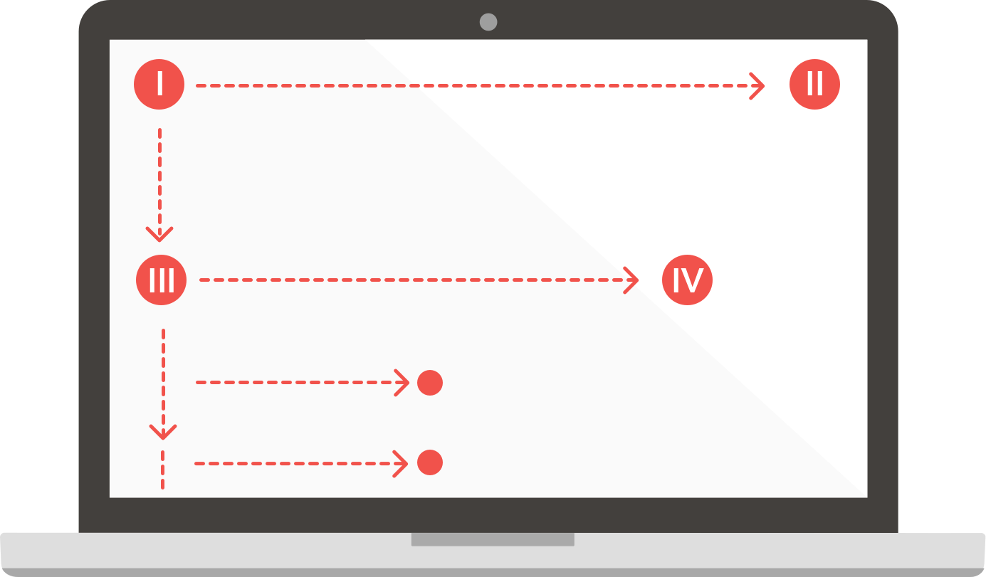
It means you should put the most important content at the top left corner.
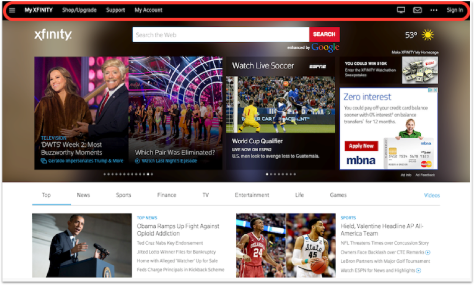
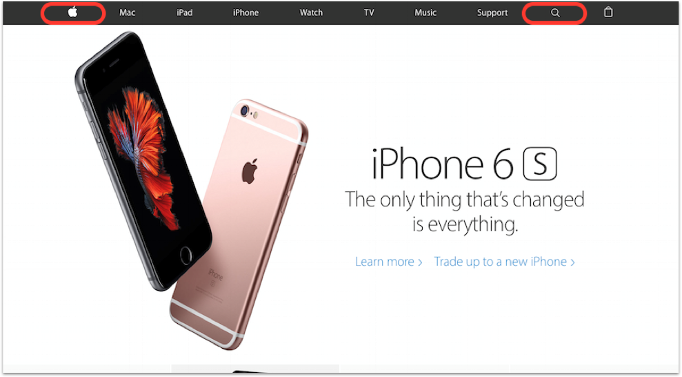
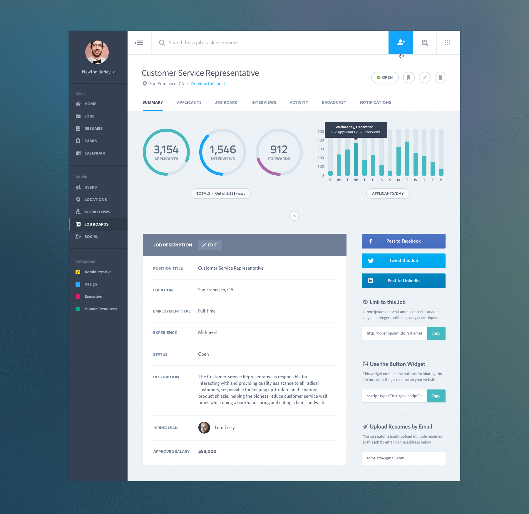
For example, you’ll typically find a logo in the top left corner. This allows companies to strengthen their brand identities. In the top right corner, you might typically find the pages for navigation, or perhaps a search bar. This allows users to navigate different pages with ease without searching throughout the page for the navigational elements. Here are two examples that adhere to this design pattern:
As you go further and further down the page, the user’s attention might wither. Therefore, put the most important content towards the top, and user bold headlines that will make your content easily scannable.
Principle #5: Use visual hierarchy
What is visual hierarchy? Well, it’s the arrangement of elements in a way that implies relative importance. it’s the designer’s attempt to guide the order in which the eyes perceive information presented.
The way we perceive information is affected by several factors that contribute to how we rank the hierarchy of the content within the layout. Let’s jump into some hierarchy basics:
I. Typography
What makes good typography? The two primary factors are legibility and readability.
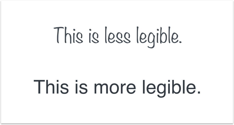
Legibility is the innate qualities of a typeface that makes each individual letterform distinguishable from one another. This is totally dependent on the typeface, so there’s nothing that you can do to make a typeface more legible, so pick appropriately.
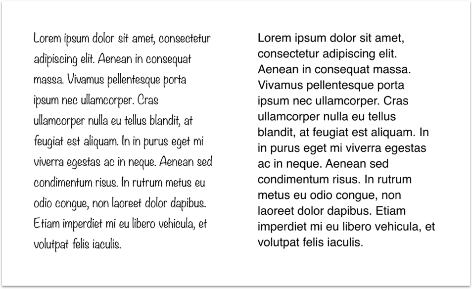
Readability is determined by how you manipulate a particular typeface to make it easier to comprehend.
Notice how the top typeface is harder to read than the bottom? If not…
What about now?
Another factor in determining how easy something is to read is the line length. If the line is too short, and the reader jumps from line to line constantly, it makes it extremely difficult for the reader to absorb information. The same goes for if the line length is too long?—?the eyes get tired quickly.
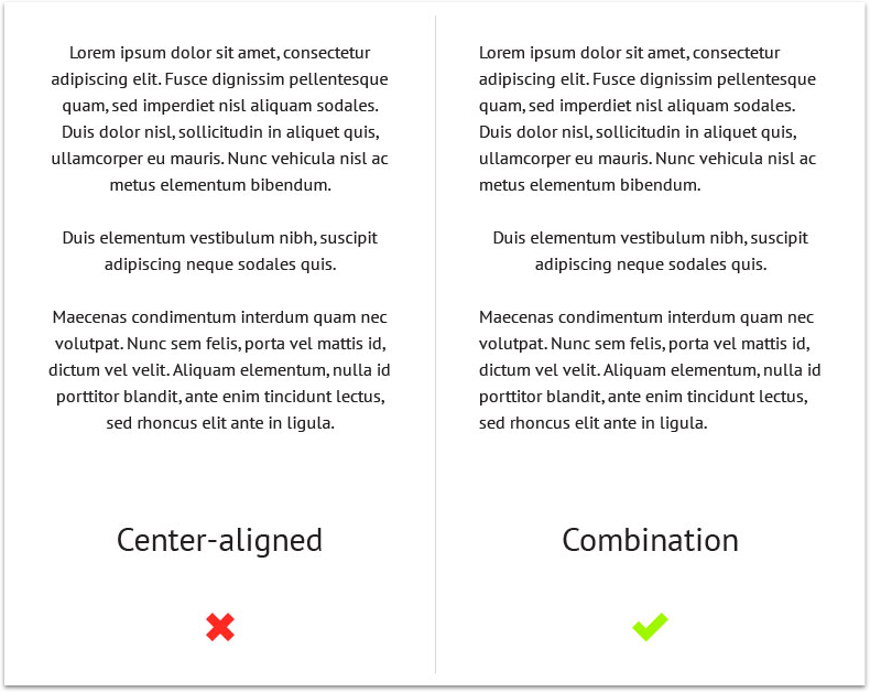
Also, never center large blocks of copy. It’s much easier for us to read a block of text that is left aligned because the eye knows exactly where the next line begins.
II. White space (AKA Negative Space)
Has anyone looked at a menu / a website / an interface and thought, “This looks and feels great, but I’m not sure why?” Well now you do. The answer is white space. White space helps with readability and comprehension immensely. A study (Lin, 2004), found that good use of white space between paragraphs and in the left and right margin increases comprehension by almost 20%. Readers find it easier to focus on and process generously spaced content.
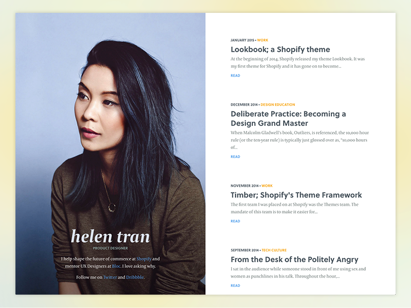
A lot of people believe white space depends on “taste”. I think it’s more objective than that. We can use white space intentionally to create a strong hierarchy. Let’s take a look at Helen Tran’s site and how she uses white space intentionally:
Beautiful portfolio! Now let’s take a closer look:
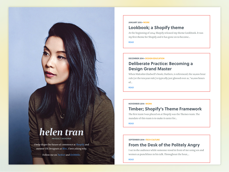
Notice how there are 4 clear blocks of content. Let’s break it down either further:
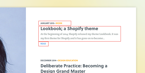
Helen uses a combination of line height, font size, color, and white space to separate content within each block itself. This allows for ease for users to naturally navigate the sections of these blocks of content.
III. Color
Color theory is really, really complex. My goal isn’t to explain the entirety of color theory, but to provide you with a few broad concepts that you might be able to leverage in your UI designs immediately.
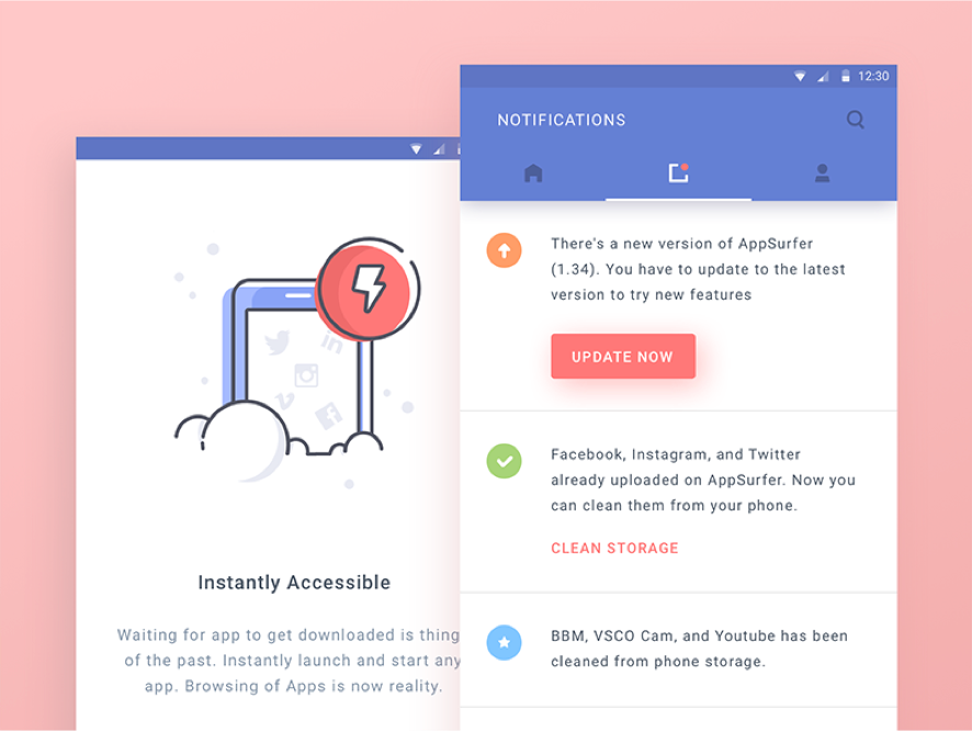
If you stare at the above picture, you’ll notice that the blue square on the left feels farther away, while the red square on the right feels closer. Warm colors come towards you, while cool colors fade into the background. Let’s take a look at this in a UI example:
In the design above, we can see how the designer is using a warm red to bring the call-to-action (Update Now) forward, while using a cooler blue to recede the navigation farther into the background. The same happens in the illustration on the left. The red lightning icon immediately stands out among the rest of the interface.
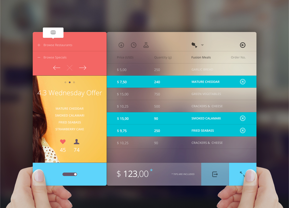
You can also use colors to group similar interface components together:
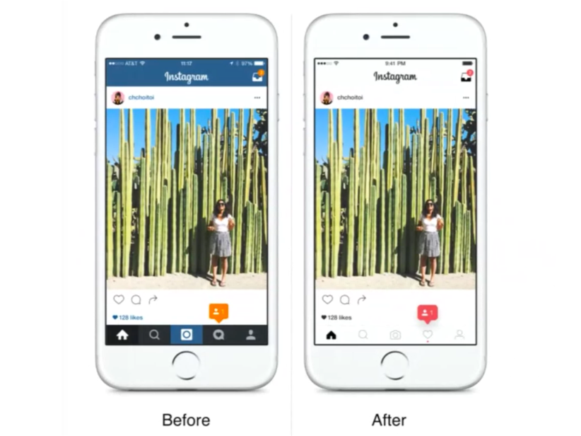
Lastly, less is more. The more colors there are, the less impact each individual color will have. A great example is Instagram’s recent redesign:
The reduction of color not only makes the photos stand out more, but it increases the effectiveness of the notifications as well because they aren’t competing with the colors in the top and bottom navigation bars anymore.
Further Resources:
This article was originally published on Jeff's Medium page.
Further reading:
- A harmonious spacing system for faster design-dev handoff
- Four Reasons Why You Should Design Without Color First
- UX Design Principles That Help You Shape The Best User Experience
- The most important and best colors in UI design
- Designing a Styleguide: Elements That Go Into Building Compelling Products
